
W&G Baird Shortlisted for 2024 irish print awards
We are delighted to announce that five of our 2024 printing projects have been selected as finalists for this year’s prestigious Irish Print Awards. The selected projects span multiple categories, highlighting our commitment to excellence in printing industry.
We have been shortlisted in the following categories:
Sheetfed Offset Colour Printer of the Year
- Irish Arts 40th Anniversary
- Vision Trimline Brochure
Magazine, Brochure and Supplement Printer of the Year
- Anthology Xmas 2024
Book Printer of the Year
- Drummonds Bathroom Catalogue
- McKenna Cookbook
Our team’s dedication to delivering the highest quality in printing and finishing is evident in these projects, each of which showcases the meticulous care and expertise invested into every piece. Here is a closer look at the details of each nominated project.
Sheetfed Offset Colour Printer of the Year
Irish Arts 40th Anniversary
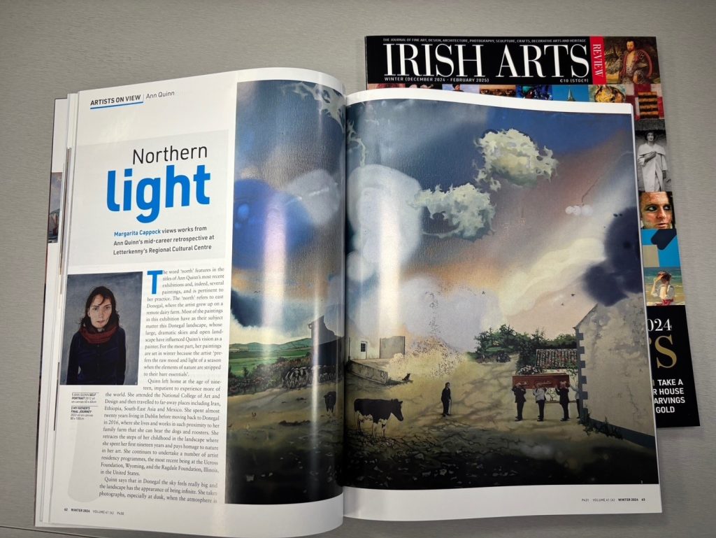
Shortlisted in the “Sheetfed Offset Colour Printer of the Year “ category this project was particularly special to the client as it celebrated their 40th Anniversary. Given the subject matter involved, colour is critical in this publication. We ran calibrated matchprints for each page and ensured that this was replicated perfectly on the press to meet with our customer’s exacting requirements and high expectations.
Our sales representative collaborated closely with the client to develop a sophisticated cover concept that incorporated an additional spot gold on the front. This complex feature significantly enhances the publication’s visual appeal, reflecting the esteemed nature of the artworks and artists featured within. The use of spot gold not only demands precision in its application but also requires careful coordination to ensure it complements the other colours without overwhelming them. The printer’s expertise in handling this specialised technique was crucial in achieving a flawless result that does justice to the magazine’s prestigious reputation.
The integration of spot gold on the cover, alongside the meticulous reproduction of fine artworks, positions the “Irish Arts Review” magazine as a standout example of excellent printing craftsmanship.
Vision Trimline Brochure
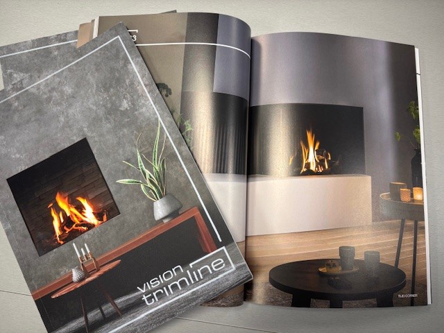
W&G Baird has worked closely with the team at Penman by developing their sophisticated range of product catalogues over recent years. Each brochure presents a unique challenge to accurately replicate and demonstrate the high quality and prestigious features of their products.
The Vision Trimline brochure required intricate attention to detail, particularly in achieving consistency in colour reproduction across various materials and surfaces. Given the range of fireplace materials, including stone, metal, and glass, each surface type posed distinct challenges in terms of ink adhesion and uniformity, making the task notably complex.
The print work required precise solid ink coverage, ensuring that the visuals were crisp, vibrant, and accurate without any variation in colour or texture, which can often be difficult when working with multiple substrates. This was especially challenging as the inks had to maintain integrity on surfaces that absorbed or reflected light differently. The process demanded expert calibration of the press to achieve smooth transitions between colours and avoid any inconsistencies, even in areas of high solid ink coverage.
The successful execution of this brochure underscores our commitment to technical excellence in complex printing scenarios.
Magazine / Brochure Printer of the Year
Anthology Xmas 2024
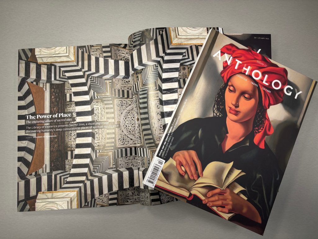
Each edition of this magazine requires a high level of execution from planning through to the finishing stages to ensure it consistently represents the required level of quality associated with the customer. We took measurable steps at each stage of the production process to ensure that the quality expected in this magazine is carried through from the first copy to the last.
Care and attention were given at the printing press to ensure that there was no loss of sharpness or vibrancy in the imagery featured throughout the magazine as colour consistency and high-quality print are essential for this eclectic magazine.
This edition required additional care due to the inclusion of two cover variations featuring paintings by the same artist. It was imperative to ensure the accurate reproduction of colour to perfectly reflect the artist’s work.
Book Printer of the Year
Drummonds 2024 Brochure
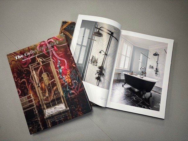
The Drummonds Bathroom Catalogue 2024 presented a unique challenge in capturing the exceptional detail of the products while accurately representing our client’s photography. With its emphasis on luxury bathroom products, achieving accurate and vibrant colour tones was critical.
Our printers, alongside our prepress team worked tirelessly to ensure that the final printed product accurately conveyed the high-end finishes and textures of the bathroom suites, which included reflective materials such as glass, chrome and marble. This required precise colour calibration and impeccable attention to detail to ensure that subtle shades and finishes were captured in their truest form.
We produced two versions of the catalogue simultaneously, one version for the US price market and one version for the UK market. This added an additional layer of complexity to include black plate changes, ensuring common sections were consistent, as well as finishing the books with two very different page extents.
The foil blocking and lamination were completed by Belfast Foiling Company and the bookbinding was completed by Enfield.
McKenna Cookbook
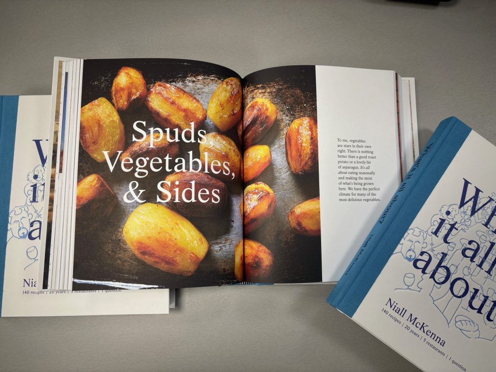
The McKenna Cookbook merits an Irish Print Award for its outstanding printing quality. It was imperative to the client that we accurately captured the vibrancy of the menu, the ingredients and Belfast’s personality, all while printing on an uncoated paper stock.
This uncoated finish not only offers a unique tactile experience but also enhances the overall feel of the book, giving it a more organic, authentic texture that complements the beauty of the recipes. To ensure the vibrancy of the colour we ran a print test prior to the main production to develop specialised profiles to capture the vivid colour photography, ensuring that the recipes on the pages looked good enough to eat.
We ensured that the use of white space within the book remained unblemished even when faced with full colour pages by scheduling appropriate drying time and meticulous attention to detail when folding.
The front cover was anti-scuff laminated by Printglaze to add a layer of durability. The quarter case binding and debossing was completed by Trinity Bookbinding creating a bright and eye-catching front cover. The level of accuracy required in debossing the design of the printed case sheet required a great deal of collaboration between ourselves and Trinity
Post a Comment